Wednesday, November 20, 2013

Statistical Map


This is a specific map where the factor measured is in variations across a geographical area. In this example populations is the measured quantity, in variation across the US. It allows individuals to compare and contrast different populations across different states which could be helpful for research when creating programs or policies.

Stadardized Choropeth Map


http://www.cdc.gov/pcd/issues/2007/oct/07_0091.htm

These maps are used to display areal averages of information that is being obtained from the variables being measures. and therefore can compare areas in different sizes. Essentially all the data is standardized. It generally uses different shades of coloring to represent different aspects of numerical data. This map measures the percentage of individuals living in poverty.

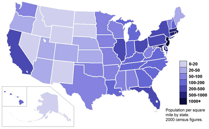
Univariate Choropleth Map


http://upload.wikimedia.org/wikipedia/commons/thumb/7/78/USA_states_population_density_map.PNG/800px-USA_states_population_density_map
Typically univariate choropleth maps describes one variable spread across a specific location, are, or region. It can be used to show information in cities, regions, countries, or globally. Other choropleth maps show more than one variable. This map shows one variable, being population per sq. mile in the 2000 census.

Bilateral Graph


A bilateral graph represents two or more variables that are related. Bilateral graphs can be show information in different ways, like line or bar. In this graph, the variable measure is the percent change to meet Kyoto Targets in reference to the countries involved in the agreement.

Isopleth


Isopleths is a type of contour lines, that connect areas on a map, that exhibit  same amount of a certain meteorological occurrence. The data has to be collected over a specific area. It is also referred to as isogram isoline, and the name isopleth is derived from plethos which means quantity
An example is population density. 

LIDAR Map


LIDAR is an abbreviation for light detection and ranging. It is a remote sensor that measures distance, uses a laser to find a target, and measure its results through the reflective light. It is useful and applied i archaeology, geography geology and more. In this case, the LIDAR image is presenting ground zero on September 2001. 

Isopach


http://www.geo.utexas.edu/faculty/barker/kempter/rbtephra.html

An Isopach map are characterized by contour lines used to measure/illustrate stratigraphic thickness variations in a given area. It is most useful in a number of fields including (not limited to) the study of geology, volcanoes, sediments,and stratigraphy. In this particular isopach the map of Rio Blanco is presented and the tephra deposition is measured after the active crater erupted.


Isohyet


An isohyet is a map that joins lines at points where equal precipitation is occurring in  given area, at a given time. This Isohyet map is of the average rainfall from the government of Austrailia.


.An isohyet map has connecting points showing the same amount of rainfall in a given period. In the map above of Australia, the colors represent different amounts of rainfall (green being the least and red being the most). 

Isotach Map


An isotach map uses contour lines similar to those seen in topographic maps. The difference is that isotach maps are measuring something entirely different: wind of equal speeds and directions, which the map makes visible for users to visualize. Essentially the connection points map out the equal wind speeds. Above is an example of an isotach that shows Kansas to the Great Lakes.

Population Profile


This is an example of a population profile. It projects the population of Botswana in 2020, with and without the AIDS epidemic. Source: United States Census Bureau, World Population Profile (2000). Population profiles are characterized by population being measured in reference to the second variable, age, and how they are in relation to one another. In this case, the determining factors AIDS. It basically charts the numbers of individuals as a function to their age. 

DLG Map


The DLG map is a digital line graph that shows features in the vector form rather tan raster format. That means that data is coded in points, lines and polygons. They are generally used in three scales, large intermediate and small, and obtains information from the USGS. This DLG is a digital image in Beaufort, South Carolina

DOQQ Map


DOQQ is abbreviated for digital orthophoto quarter. This georectified map  (tied to coordinates and map projections) is a raster formatted photo image by high-altitude aerial photography. he DOQQ technique uses various types of films so that the image may be manipulated to be false color-infrared or in real color. The reason that false color is used is because it helps differentiate terrain features at the surface. The image above is a DOQQ image in Texas from 1995.

Digital Elevation Model (DEM Map)


DEM is an abbreviation for digital elevation models. A DEM is a digital map from USGS and consists of terrain and elevation features in the raster format. This means that DEM map data is observed, recorded and saved in a pixel. The DEM relies on a coordinate system and map projections, and does not have to be colorized. In this image the DEM is used to construct this image of Eritria, Africa.

Digital Raster Graphic (DRG Map)


                http://lter.msu.edu/maps/gis_data.php
A DRG map is short for digital raster graphic. This type of map is typically results from scanned topographic maps and is a digital image. Just as the DEM, it is created by the USGS and saved in the raster format (observed, recorded and saved in pixel or cell).This particular map is an image of a part of Michigan, in which the Kellogg Biological Station of Michigan University is located.

Doppler Radar - Hurricane

Doppler radar imagery is very useful in mapping and predicting the weather. Predicting weather and mapping virtually go hand in hand predicating weather is best done spatially. Doppler radars be used in aviation, sounding satellites, and meteorology, following large storms or hurricanes, and giving the daily local wether to citizens. This doppler radar image shows how a hurricane over the state of Florida, I know first hand how important the use of doppler radar is here in Florida!

Nautical Maps


Nautical maps are very useful tool for maritime area and navigation in the marine, as well as in the coastal areas. Generally the map shows the depths of water, prevalent topographic features of the coastal areas adjacent to the body of water and the shorelines of these lands. Here we can see the Gulf of Mexico and the surrounding coastal areas. 

Thematic Map - Politics

A thematic map is a type of map that portrays a certain theme over a certain area. The theme can have more that one variable (i.e. Republicans and Democratic States) represented. The themes can range anywhere from social, political, agricultural, cultural to physical. These specific themes can be measured in certain area that can be a city, region, country or even on global scale. This specific map, hold a political theme, showing the major political parties of the US.

Range Graded Proportional Circle Map


http://www.neiu.edu/~nerobert/Circle%20Map
A range graded proportional map is a type of point pattern map, and one type (of two) proportional circle maps. Only a certain set of circles are used in the map to convey the data measured/observed. It illistates circes in relation  to specific ranges of data

Nominal Choropleth Map


A nominal area choropleth is a type of thematic map and displays nominal-level areal data. Furthermore, this kind of data is not organized quantitatively, but qualitative instead. What this maens is that certain characteristics (i.e crime, minorities, race, etc) are categorized together, regardless of the numerical values involved. There is no ranking from high to low, or better to worse. In this example, percentages of minority groups are observed and categorized by color in each state.  

Bivariate Choropleth Map


Bivariate choropleth maps are able to map the distribution of two different variables on one plane. Generally one variable is presented in terms of different shadings/colors (based on specific intervals) while the other is presented on the same area but in the form of patterns (polka dots, horizontal lines, vertical lines, etc.) It's useful as you can see both sets of data in a certain area at the same time. This map is observing the relationship between median house income and population.