Scatter plots basically shows relationships between two variables. Each observation is shown with a dot in the place of its value. A trend line is typically used to show the overall direction in which the data is going, otherwise known as the graph's trend. A weak or strong relationship can also be see by looking at the dots, and their proximity to the trend line (closer means stronger relationship). In this scatter plot, the relationship between income and years of experience is looked at and measured. It also has a trend line, that happens to be positive in this case, which means as years of experience increases, so does income.
Monday, November 18, 2013
Scatter Plot - Income vs. Experience
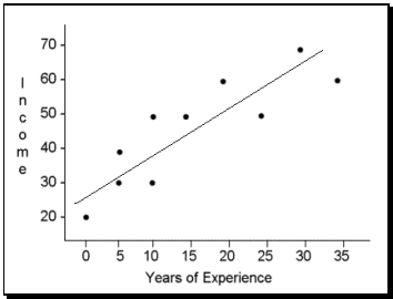
Scatter plots basically shows relationships between two variables. Each observation is shown with a dot in the place of its value. A trend line is typically used to show the overall direction in which the data is going, otherwise known as the graph's trend. A weak or strong relationship can also be see by looking at the dots, and their proximity to the trend line (closer means stronger relationship). In this scatter plot, the relationship between income and years of experience is looked at and measured. It also has a trend line, that happens to be positive in this case, which means as years of experience increases, so does income.
Subscribe to:
Post Comments (Atom)

No comments:
Post a Comment